Oct 10, 2022
5 Best Practices for Great Landing Pages
The goal of a landing page is to nurture customers who aren’t yet ready to buy, and to demonstrate how your company provides specific value in that area. Such a page is important when trying to drive sales of your product or service, boost customer experience and help you gain customers quickly with enticing offers.
In this blog, you'll learn about the key components of a great B2C and B2B landing page and how you can integrate them into your content to increase conversions.
What are landing pages?
A landing page is a web page created for a particular purpose and is a standalone page you can set tracking parameters on and track user behavior. Landing pages typically have one of five purposes:
- Encourage a visitor to click (to go to another page, on your site or someone else's).
- Get a visitor to make a purchase.
- Encourage a visitor to give his/her permission for you to follow up (by email, phone, etc.).
- Get a visitor to tell a friend about your products/services.
- Get a visitor to learn something, or leave feedback. This might include posting a comment or rating your products or services.
When a potential customer visits your landing page via organic search, PPC ads, social ads or promotional emails, they’re showing interest in the specific value proposition or product on which they’re clicking. However, a landing page isn’t enough to drive a purchase by itself.
There are specific ways you can organize the content to drive conversions, and eventually sales. Here are five best practices to achieve landing pages that attract more customers and amplify their signals of interest.
1. Craft the perfect headline
A headline is the first thing a user sees on your landing page, and the majority of visitors will read your headline but only skim through the copy. So it’s important to write headlines that sell.
To do that, avoid headlines that are ambiguous or don’t sum up your content correctly. Firstly, it’s important to make sure you cover your content in an engaging, concise and eye-catching way. Secondly, make sure the headline conveys the benefits of your offer. This will make users more likely to stay on the page and act on the call to action.
Thirdly, keep in mind that an optimized page title (including a keyword you are targeting) can also help you rank better in the search engines (check out this guide to YouTube SEO and ranking for tips). Having an indexed landing page on your site that is keyword optimized raises its visibility for that particular query.
Finally, always ensure that the headline of your landing page matches the headline of your email, ad, SEO copy, etc. for a seamless user experience.
For example, if your ad is for “boutique stores San Francisco” then the headline of your landing page should have the words “boutique stores San Francisco” in the headline and be accompanied by relevant content.
Top tip: Learn all about how local SEO to improve your visibility online.
2. Build a separate landing page for each active promotion
It’s crucial that the content a user clicks on closely matches the headline and body content of your landing page. This is called ‘message match’, and it’s defined as “[...] matching the heading of your landing page with the headline of the ad or piece of marketing your visitor clicked.”
Message match is an important part of a great user experience. And because most B2C companies create and distribute a large amount of content across many different categories and product types, simply sending users to your homepage or a different product page from your promotional pages won’t allow that message to match up properly.
For example, if you send an email that advertises local concerts in your area, including one they might be especially interested in, he/she will click on your CTA button to buy tickets for that concert. If instead of a ticket page for that artist, you send the user to your site’s homepage where the promotional content is for baseball tickets, he/she will probably be pretty annoyed.
Even if the concert tickets are still available, the user may become frustrated or confused and give up on buying them altogether. To combat such an issue, any promotion you run should direct customers to a dedicated landing page where the headline and content match your ad or email promotional copy. The user should immediately see contextual clues that relate to a click or search. You don’t want to make users take additional steps to find the correct content.
Top tip: Learn more about the art of writing a marketing email.
3. Use Images Carefully
65% of people retain information paired with relevant images — compared with just 10% of people who only hear the same information. Because of this, it’s best to provide an image that highlights someone using your product or service, or illustrates what the visitor will receive if they convert on your landing page.
But be careful. Your images should always help you earn conversions, not distract your visitors. Not only should your images be inspiring, original and eye-catching, but they should be carefully positioned to inspire the reader to action. A concise, educational video can also help boost conversion rates if you’d prefer to go that route. Plus, with all the tools and software available now it’s easy to make great videos without hiring a professional.
Keep in mind that using images of people can be especially tricky. These types of images should have the person/people facing toward the call to action button. See the eye tracking survey below based on which way the baby is facing.
Humans are social, and we’re wired to look where other humans are looking. The red area above illustrates how people interacted with the form based on the baby’s direction, and the one in which he was looking at the form is the clear winner.
Top tip: For guidance on using social media imagery, check out our presentation ‘Best Practices for Using Images on Social Media’.
4. Craft Engaging CTAs
Your call-to-action (CTA) button is the most important part of your landing page because it’s the way that new leads are created in your system. Without this button, you don’t get potential new customers, and the rest of the copy and images on your page lose their importance. Great CTAs (that involve 3 key elements) can increase your conversion rate by tens or even hundreds of percentage points.
Visitors need to feel compelled to click on the CTA button, so you must convince them to do so. Avoid boring or unclear copy like “submit” or “get started” and focus on engaging, personalized copy such as “Send me the eBook” or “Get my free trial.” Make it crystal clear what the user will receive by clicking on the button.
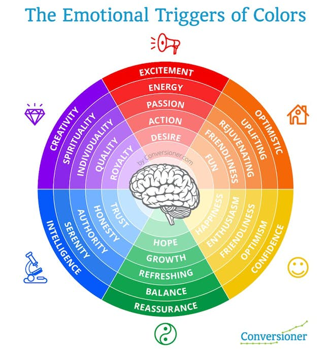
In terms of CTA color, your button should contrast with its surrounding elements to draw the maximum amount of attention. Use A/B testing to see which colors work best for your business. Preferences can often vary by industry and persona, so it’s important not to make assumptions based on “best practices” that may not be applicable for you. That being said, it’s typically best to keep your page color and the objects on it to the left hand side of the color wheel shown below (green, blue, purple) and use contrasting colors for your CTA button(s).
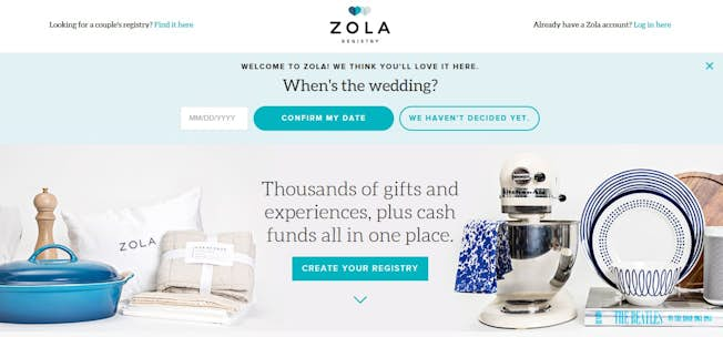
To demonstrate great CTAs that work well with text and color, here’s an example of a Zola advertisement. The advertisement was served up on Facebook in the following way:
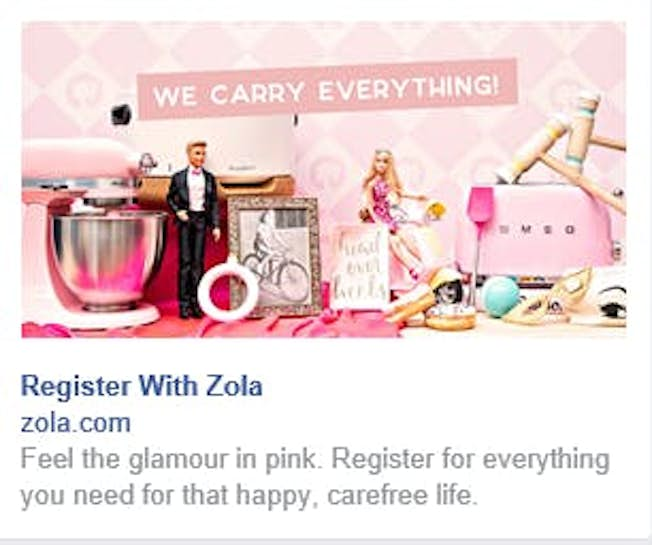
After clicking on the image, we were directed to the homepage, which has an engaging CTA that gives a clear indication of next steps.
Top tip: Check out our free ‘Design Fundamentals: Color Theory’ course with HubSpot to see how color impacts your marketing.
5. Don’t Overcomplicate Your Forms
A poorly-designed lead capture form can be the death of your conversions. Prospects don’t want to spend a lot of time divulging large amounts of personal information just to claim an offer. Only ask for the information you really need, and keep in mind that users will provide additional information later when they become customers.
Your campaigns will benefit from A/B or split testing, which basically pits one landing page against another to see how it performs. This can be useful for form design as it shows how much information a customer is willing to input. Too many fields can turn a user away. Download our A/B testing toolkit to optimize your landing pages.
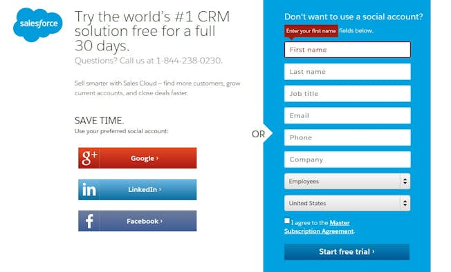
Many companies now give prospects the option to fill in their information via their social media platforms. This easy option is a great fit for many busy consumers. Here’s a great example from Salesforce:
Top tip: in a cookieless world where data privacy is of ongoing interest, learn about how first-party data is more important than ever.
Final tips for your landing pages
In short, to make your landing pages more effective, you should:
- Make headlines clear, concise, and engaging.
- Build a separate landing page for each active promotion. Make sure the text and images in your advertisement or email directly match your landing page offers.
- Use images carefully. Make sure they drive conversions - not distract your potential prospects. When using photos of people, make sure they are facing the form you want your prospects to fill out.
- Build engaging CTAs that include text that inspires action, and consider your colors carefully. Make sure your language is tailored for each specific offer.
- Keep your forms simple, concise and easy to fill out. Consider giving users the option to fill out their information via their social media accounts or Gmail.
Updated 2022
Create landing pages that engage and convert
Design and implement digital marketing campaigns that drive engagement and leads. DMI and Neil Patel’s Professional Diploma in Search Marketing covers all the key areas such as SEO, social media marketing, display and video, content marketing, PPC, analytics and much more. Get started today to supercharge your digital marketing activities.
Related
Upgrade to Power Membership to continue
your access to thousands of articles, toolkits, podcasts, lessons and much much more.
Become a Power Member
- Login
- View Courses
- - - -
- Courses
- Resources
- - - -
- My Account
- Change Password
- Logout